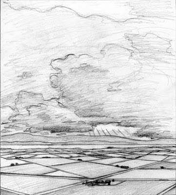
As I mentioned earlier I am working on a new project for McGraw-Hill. It's a landscape for the cover of a teaching guide. Eventually I will do it in either oil or acrylic but for now I wanted to play a bit with color. I took my original drawing into Photoshop and pretty quickly applied color. Though on the final I will use a traditional medium, at this stage it's nice to save some time. I know the benefits of Photoshop!


Hi Craig
ReplyDeleteThese are lovely, and I love that you can use photoshop in the early stages, but refrain from using it for the final art.
I prefer the one with the bluish tones. To me it more accurately represents the light that one would actually see under large cloud forms. I think though that you could warm it up somewhat...you are showing that the sun is casting light in the distance, and somewhere that light would create some golden hues.
This looks like Lake Champlain to me. Beautiful!
Thanks for the feedback! I sent the publisher both so we'll see. Maybe it will end up a combo of both. They wanted something more moody and less realistic in color.
ReplyDeleteI love your stuff, so textural. You are rocking the SCBWI awards. Congrats!